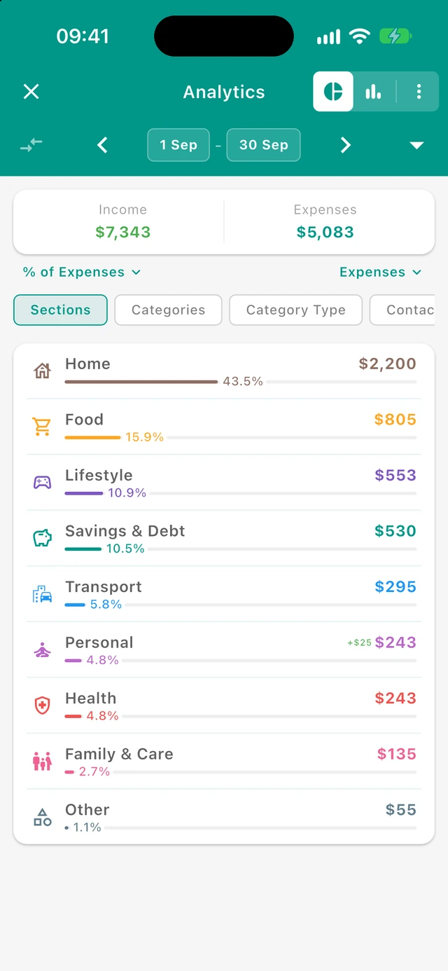
Accessing Analytics
You can open Analytics from:
- The Analytics action on the Budget screen
- The "Analytics" option in a category's menu on the Budget screen
- The "Analytics" option in a section's menu on the Budget screen
- The pie chart icon when viewing an account, contact, or tag's transactions
- The Analytics action in a saved set’s menu
For accounts, there is also a separate Flow Chart screen available from the account menu on the Accounts screen. That view is different from Analytics: it focuses on account inflow, outflow, and balance trends for one account rather than category/contact/tag-style breakdowns.
Analytics can be viewed for:
- Your entire budget (all transactions)
- A specific account
- A specific budget section
- A specific category
- A specific contact
- A specific tag
- A specific expense type (Needs, Wants, or Savings)
- A contact type (such as Stores)
- A saved set, including its include/exclude conditions
Screen Layout
Title Bar
The top bar shows:
- Back button - Return to the previous screen
- Title - The current entity (e.g., "Groceries" or "Store A").
- View toggle - Switch between Breakdown view (pie chart icon) and Trends view (bar chart icon)
- More analytics (⋮) - Opens extra analytics views. Currently includes Spending calendar (full-year daily spending heatmap)
Breadcrumbs
After drilling down, a compact, horizontally scrollable text path appears below the summary in both Breakdown and Trends, for example Vacation › Groceries › Store A. The app-bar title still shows the current entity. Tap an earlier breadcrumb to return to that screen with its period and selected view restored; Back returns one level. When the selection has no data, the path remains available above the empty state.
Period Picker
Below the title bar, the period picker lets you select the date range for analysis:
- Compare icon (⇄, left side of the period picker) - Opens Compare period options so you can compare the current range with a previous period or the same period last year (see Period comparison below). The icon is brighter when comparison is active.
- Left/Right arrows - Navigate between periods (month, year, etc.)
- Start date - Tap to open the date picker and set a custom start date; the date picker offers quick options such as "This month" and "This year" (select full month or full year).
- End date - Tap to open the date picker and set a custom end date
- Dropdown (down arrow) - Opens a list of quick period options: This month, This quarter, This half-year, This year, Previous year, All time
Period comparison
Period comparison lets you judge whether income and spending are up or down versus another date range. It applies to the summary card, breakdown list, and trends details while comparison is enabled.
How to enable it
- Tap the compare arrows icon on the left of the period picker
- Choose one option in the bottom sheet:
- Previous period - The equally long range immediately before your current start–end dates. For whole-month selections (for example one month, one quarter, or a half-year of full months), Budgetum shifts by that many calendar months. For other custom ranges, it shifts by the same number of days.
- Same period last year - The same start and end dates shifted back one year (day is clamped to the last valid day of the month when needed, for example Feb 29 → Feb 28)
- To turn it off, open the sheet again and tap Disable comparison
The sheet shows the resolved comparison date range under each option so you can confirm what will be used.
What changes when comparison is on
- Summary card - Income and expense totals show change indicators versus the compared period
- Breakdown list - Each row can show amount and percentage change versus the same item in the compared period (higher spending is treated as worse for expenses; higher income is better for income)
- Trends - Selected-period details can include comparison deltas when comparison data is available
Period comparison is separate from the Trends vs Income overlay (which compares expenses to income inside the same selected period).
Summary Card
At the top of the content area, a Summary Card shows:
- Income - Total money received in the period
- Expenses - Total money spent in the period
- Remaining - The difference (income minus expenses); shown in Trends view only when you have income, and not shown in Breakdown view
When period comparison is enabled, income and expense lines also show how they changed versus the compared period.
The summary covers the full selected period and every active filter, regardless of how many transaction rows are currently displayed. It shows gross expenses and received income, including refunds (offset income). For a $100 purchase and a $20 refund, the summary shows $100 expenses and $20 income; the expense breakdown shows $80 net spending. See Refunds and tag allocation.
Breakdown View (Pie Chart)
The Breakdown view shows how your spending or income is distributed across different categories, contacts, or other groupings.
Income/Expense Dropdown
When you have both income and expenses, a dropdown (top right in the filter area) lets you switch between:
- Expenses - See how your spending is distributed
- Income - See how your income is distributed
Breakdown Type
Below the income/expense dropdown, filter buttons let you choose what to break down by. Available breakdowns depend on what you're viewing:
| Starting context | Possible breakdowns |
|---|---|
| Budget (all) | Sections, Categories, Expense Types, Contacts, Contact Types, Tags, Accounts |
| Account | Sections, Categories, Expense Types, Contacts, Contact Types, Tags, Descriptions |
| Section | Categories, Expense Types, Contacts, Contact Types, Tags, Accounts, Descriptions |
| Category | Contacts, Contact Types, Tags, Accounts, Descriptions |
| Contact | Sections, Categories, Expense Types, Tags, Accounts, Descriptions |
| Contact type | Sections, Categories, Expense Types, Contacts, Tags, Accounts, Descriptions |
| Tag | Sections, Categories, Expense Types, Contacts, Contact Types, Accounts, Descriptions |
| Expense type | Sections, Categories, Contacts, Contact Types, Tags, Accounts, Descriptions |
| Saved set | Sections, Categories, Expense Types, Contacts, Contact Types, Tags, Accounts, Descriptions |
Only breakdowns that separate the current transactions into at least two different nonempty groups appear. Single-group breakdowns and tags attached to exactly the same purchases are omitted. A grouping already selected in the navigation path is not offered again.
Equal amounts do not make a grouping redundant: two stores with $50 each still represent different purchases. Groups may overlap. If both tags occur on every matching transaction, Tags adds no split and is hidden. A single populated group plus transactions without that value is also hidden; no extra “Unassigned” group is created.
Transactions option
Transactions is the last option in the existing, left-aligned selector. It uses the standard dense transaction rows, grouped by date and then by receipt/contact where possible. Expenses includes matching refunds; Income excludes refunds. Tap a group to inspect its matching transactions, or use the usual transaction edit and long-press actions.
- The percentage control is hidden while Transactions is selected.
- When no useful breakdown remains, transactions appear automatically and the redundant selector is hidden.
- Initially about 100 transactions are displayed. A receipt/contact group crossing the cutoff is included in full, so a page can exceed 100. Show more extends the list by another approximately 100 transactions without splitting groups.
- Groups contain only transactions matching the active analytics filters, even if the original receipt contains other purchases.
- The display limit does not affect totals, percentages, comparisons, or charts.
- Changing periods reevaluates the available breakdowns. An explicitly selected Transactions view stays selected.
Percentage Mode (Expenses Only)
When viewing an expense breakdown and the period has income, a percentage control lets you choose how percentages are calculated:
- % of Expenses - Each item’s share of the positive net expense totals in the breakdown. Rows with zero or negative net spending show 0%.
- % of Period Income - Each item as a percentage of your total income for the period
- % of Entity Income - Each item as a percentage of income for this specific entity (shown only when viewing an account, contact, tag, etc. that has income and where that entity's income differs from total period income)
This helps you understand spending relative to what you earned.
Breakdown List
The main area shows a list of items with:
For each item:
- Icon and name - The category, section, contact, or tag
- Amount - Total spent or received. When viewing expenses, if the item has offset income (matched income), a small “+X” shows the offset amount and the main amount is net (expense minus offset).
- Percentage - Share of the total
- Progress bar - Visual representation of the proportion
- Period comparison deltas (when enabled) - Amount and/or percentage change versus the compared period
Items are sorted by net amount (largest first).
Tapping an item adds it to the current analytics selection and opens the next level for the same period and income/expense mode. Earlier selections remain active, including saved-set conditions: Vacation → Groceries → Store A shows only grocery purchases at that store within Vacation. Descriptions open matching transactions directly.
Changing dates or comparing periods keeps every selection in your analytics path. For example, changing months while viewing Vacation › Groceries › Store A shows that month’s grocery purchases at Store A within Vacation. It does not switch to all Store A purchases. Returning through breadcrumbs restores the earlier screen’s period and selection. Analytics refreshes after transaction changes and after closing a transaction group.
Trends View (Bar Chart)
The Trends view shows how your spending or income changes over time, helping you spot patterns and trends.
Display Type
Toggle buttons let you choose what to display:
Available display types:
- All Expenses - Total expenses over time
- Needs+Wants - All expenses excluding savings (when you have both savings and other expenses)
- Needs - Only essential expense categories (when you have them)
- Wants - Only discretionary expense categories (when you have them)
- Savings - Only savings categories (when you have them)
- Income - Total income over time
- Remaining - Balance (income minus expenses) over time (when you have both income and expenses)
- Saved + remaining - Running total of savings plus remaining money (when you have income, expenses, and savings)
Only types that have data appear as options.
Time Period
The chart groups data into time buckets (one bar per day, week, month, or year). You choose the grouping via a period selector; only periods that make sense for your date range are offered:
- Days - One bar per day. Available only when the selected range is about 2 months or less (62 days or fewer).
- Weeks - One bar per week. Available when the range is about 4 months or less (124 days or fewer).
- Months - One bar per month. Available when the range is less than about 3 years.
- Years - One bar per year. Always available, regardless of date range.
For example, "This month" will typically offer Days and Weeks; "This year" will offer Weeks, Months, and Years; "All time" might offer only Months and Years. Tap the period selector (showing the current grouping) to switch.
Income Comparison (vs Income)
When viewing expense data and you have income:
- A toggle appears: vs Income
- Enable it to overlay your income on the expense chart
- This helps visualize if you're spending more or less than you earn in the same selected period
This is different from period comparison (previous period / same period last year) controlled from the period picker.
Section colors on expense bars
When the Trends display type is an expense view (All expenses, Needs+Wants, Needs, Wants, or Savings) and section breakdown data is available, a Sections toggle (pie-chart outline icon) appears next to vs Income.
- Turn it on to paint each expense bar as a stack of section colors (each section uses that section’s color from your budget)
- Sections are stacked with the largest overall share toward the bottom for a stable order across periods
- Very small section slices (under about 1% of the bar) are omitted from the stack so the chart stays readable
- Dimmed (non-selected) bars keep the same section colors at lower opacity
- Selecting a period can show the matching section breakdown details using those same section colors
Turn the toggle off to return to solid expense bars (theme expense/error color, or income color when the display type is Savings).
Chart Display
The bar chart shows:
Axes:
- X-axis (bottom) — Time periods (days, weeks, months, or years); only a subset of labels is shown to keep the chart readable.
- Y-axis (left) — Amount in your currency.
- Bars — Height is the total for that period. The chart has light horizontal grid lines to help read values.
Bar colors:
- Expenses (solid) — Theme error color (typically red), so they stay clearly distinct from income. When the display type is "Savings", bars use the app's income color instead.
- Expenses (section colors) — When the Sections toggle is on, expense bars are multi-colored stacks using each budget section’s color (see above).
- Income — App income color (e.g. green), used for income bars and when "vs Income" is on.
- Remaining (balance) — Income color for positive balance, expense (error) color for negative.
- Saved + remaining — Income color for positive totals, expense (error) color for negative.
Grid below the chart:
A grid of cells appears below the chart, one cell per time period (only periods with data are shown). Each cell shows the period label and the amount(s) for that period. The grid uses up to four columns and extends downward as needed. When period comparison is enabled, cells can also show change indicators.
Selecting and scrolling:
- Tap a bar — Selects that period; the view scrolls so the corresponding grid cell is brought into view.
- Tap a grid cell — Selects that period and scrolls so the chart is visible. Tapping the same bar or cell again clears the selection.
- The selected bar and its grid cell are highlighted (full color and border); other bars and cells are dimmed. Use this to match a bar to its detail in the grid or to focus on one period.
- With Sections enabled, the selected period can show a section breakdown list that matches the stacked bar colors. Tapping a section preserves the existing analytics filters, the selected bar’s date range within the current period, and its expense-type restriction (for example, Needs).
Entity-Specific Analytics
Analytics starts with the entity or saved set you opened it for. Every later selection adds a restriction to that starting context; it does not replace it. The following sections describe the entry views. Actual breakdown choices are limited to useful, unused groupings.
Budget Analytics (All Transactions)
- All transactions across accounts; no entity filter
- Break down by sections, categories, expense types, contacts, tags, or accounts
- Compare income vs. expenses for the whole budget
Account Analytics
- Only transactions where this account is the source or destination of money (transfers and balance adjustments are not shown)
- See which categories, contacts, and tags are linked to that account’s income and expenses
- Break down by sections, categories, expense types, contacts, tags, or descriptions
- This is different from the account-specific Flow Chart screen on the Accounts screen, which focuses on money moving through the account itself
Section Analytics
- Only transactions in categories that belong to this section (income and expenses)
- Break down by categories, expense types, contacts, tags, accounts, or descriptions
- See how the section’s total is distributed and where it comes from or goes to
Category Analytics
- Only transactions in this category (income and expenses)
- Break down by contacts, tags, accounts, or descriptions
- See where you spend or earn for this category and how it changes over time
Contact Analytics
- Only transactions linked to this contact (store or person)
- Break down by sections, categories, expense types, tags, accounts, or descriptions
- See what you buy or receive there and how it trends over time
Tag Analytics
- Only transactions that have this tag
- Break down by sections, categories, expense types, contacts, accounts, or descriptions
- Useful for project or trip expense tracking
Expense Type Analytics (Needs / Wants / Savings)
- Only transactions in categories of this type (Needs, Wants, or Savings)
- Break down by sections, categories, contacts, tags, accounts, or descriptions
- See how much goes to that type and where it goes
Saved Set Analytics
- Opens with the set’s resolved period and include/exclude conditions.
- Further selections stay inside the set:
Vacation › Groceries › Store Ameans all three conditions apply. - Changing dates reloads the set for the newly selected period; it does not edit the saved set’s definition.
- Saved Sets explains how to open and configure a set.
Understanding the Data
What's Included
Analytics uses only stored transactions in the selected date range:
- Income and expense transactions (saved in the app)
- Both manual transactions and those created from receipts
- Transfers and balance adjustments are not loaded for analytics, so they never appear in totals or breakdowns
What's Excluded
Analytics excludes:
- Preview (forecasted) transactions — recurring schedule previews for the period are not included; only saved transactions are used
- Transfers and balance adjustments — these are filtered out of the data set for analytics
Refunds and tag allocation
Refunds (offset income) are included in the summary’s received-income amount and shown alongside purchases in the expense Transactions view. They are excluded from the ordinary Income breakdown. In expense breakdowns, refunds reduce each item’s gross expense to its net amount, including negative net amounts when refunds exceed purchases. If only refunds match your selection, you can still review them in Transactions.
When a transaction has multiple tags, its amount is divided equally between those tags. Refunds use the same allocation: a $100 expense and $20 refund, both tagged A and B, contribute $50 expense and $10 refund to each tag, or $40 net each. Drilling into a tag shows the full matching transactions; its transaction total may therefore differ from that tag’s allocated amount in the parent breakdown.
The spending calendar uses gross daily expenses or ordinary income and excludes refunds from its day shading. Its amounts therefore need not match a net expense breakdown.
Date Range Matters
The data shown depends on your selected date range:
- Choose "All Time" for complete history
- Use the period dropdown or tap the dates for presets (This month, This year, etc.)
- Use custom start/end dates for specific analysis (e.g., vacation or project period)
Empty State
If there's no data for the selected period and view:
- A message indicates no data is available (the message differs for Breakdown vs Trends)
- Try selecting a different period or breakdown type
- Check that you have transactions in the selected date range
Spending calendar (year view)
Spending calendar is a full-screen year heatmap of daily spending (or income) for the same entity you opened Analytics for.
How to open it
- On the Analytics screen, tap More analytics (⋮) in the app bar
- Choose Spending calendar (“Daily spending for the year”)
The calendar opens for the year of the Analytics end date.
What it shows
- A vertical year calendar with months in a compact two-column layout
- Each day cell is shaded by that day’s total amount (darker = higher)
- Year navigation with left/right controls in the app bar (you can move back freely; forward only up to the current year)
- If both expenses and income exist for the entity/year, an expenses/income dropdown switches which amounts color the calendar
- Empty years show “No transactions for this year”
Day drill-down
When a day has an amount greater than zero and day navigation is available, tap the day to open its transactions. A calendar opened after drilling down retains every analytics filter and opens the matching day in the analytics Transactions view.
Tips for Using Analytics
-
Start with the big picture - Use "All Time" to see overall patterns, then narrow down
-
Compare periods - Use the period picker’s compare icon for previous period or same period last year, and also try different months/years manually
-
Use breakdown types - Try different breakdowns to find insights:
- Categories show what you spend on
- Contacts show where you spend
- Tags show why you spend
-
Check vs Income on trends - Overlay income on expense bars to see if you're living within your means in the same period
-
Use section colors on trends - Turn on the Sections toggle to see which budget sections drive each bar
-
Tap to drill down - Each selection narrows the current data. Choose Transactions at any level, or continue until transactions appear automatically.
-
Open the spending calendar - Use More analytics → Spending calendar to spot high-spend days across a full year
-
Track expense types - If you categorize expenses as Needs, Wants, and Savings, the trend view helps you balance them
-
Use entity analytics - Open analytics from specific accounts, contacts, or tags for focused insights
-
Watch for spikes - The trend chart and spending calendar help identify unusual spending days or months
-
Review monthly - Regular analytics review helps you stay on track with your budget goals
Common Questions
Why don't I see certain breakdown types? A breakdown must offer at least two different nonempty groups and must not already be selected in the navigation path. Contacts is hidden if all matching purchases have the same contact; Tags is hidden if every tag covers exactly the same purchases. When no useful grouping remains, the app shows transactions.
Why are the percentages different from what I expected? Check your percentage mode. "% of Expenses" uses positive net expense totals in the breakdown; "% of Income" uses the selected income denominator. Refunds and amounts allocated across multiple tags can affect the displayed shares.
Can I see analytics for a specific date range? Yes. Changing the period reloads the matching data while retaining your starting entity or set and every drill-down filter. Period comparisons apply that same selection to the comparison dates.
How do I compare this month to last month or last year? Tap the compare arrows on the left of the period picker, then choose Previous period or Same period last year. Disable comparison from the same sheet when you are done.
Why don't I see section colors on the trend chart? Section-colored stacked bars appear only on expense trend types when section data exists, and only after you turn on the Sections toggle (pie-chart outline icon) next to vs Income.
Where is the year spending calendar? On Analytics, tap More analytics (⋮) → Spending calendar.
Why are some transactions missing from analytics? Analytics uses only stored (saved) transactions in the selected date range. Preview (forecasted) transactions from recurring schedules are not included. Transfers and balance adjustments are also excluded from the analytics data.
Desktop Analytics (budgetum.app/analytics)
Desktop Analytics is a separate, browser-based reporting experience for computers. It complements the in-app Analytics screen with larger layouts and additional reports.
How to open it
- In the app, go to More → Advanced Features → Import / Export
- Export your transactions (optionally enable Include analytics data to get a ZIP with
transactions.csvplusanalytics.json) - On a computer, open budgetum.app/analytics
- Choose the exported
.csvor.zipfile
You can also open About desktop analytics from Import / Export for an in-app preview of the desktop reports, privacy notes, and a copyable link.
Privacy
Desktop Analytics is built for desktop use and is private and offline in the browser: your chosen file is read locally, and your transaction data does not leave your device.
What you can explore
Desktop reports include:
- Overview - Income, expenses, remaining money, spending mix, and cash flow in one dashboard
- Money flow - How money moves across accounts and related activity
- Breakdown - Group spending or income by section, category, contact, account, tags, and more
- Trends - Compare monthly income and expenses with charts and detailed hover insights
- Spending calendar - Monthly grids, yearly strips, and weekday patterns
- Categories / Contacts / Tags - Entity-focused reports with trends and related activity
- Sets - Use Saved Sets from your export (when analytics metadata is included) as filters
- Recurring - Recurring income and expenses by month, plus schedule review
- Capital - Net worth style view across assets, liabilities, and account groups over time
- Transactions - Search and inspect exported transactions
CSV vs ZIP
- CSV only - Works for transaction-based reports from
transactions.csv - ZIP with analytics data - Adds
analytics.jsonso Desktop Analytics can use richer metadata (icons, colors, recurring templates, saved sets, account details, and similar export extras). Entity matching is name-based because exported entity names are treated as unique for this app
For export steps, columns, and import, see the Import / Export section in the Settings documentation.